Emerald Green: 2013 Pantone Color of the Year

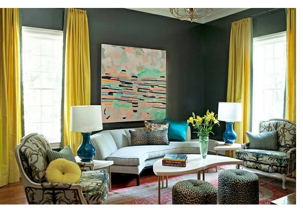
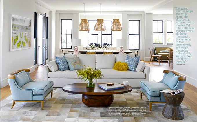
Every December Pantone picks the “new color of the year”. If you are not familiar with Pantone Inc; it is a corporation in New Jersey that is best known for its Pantone Matching System (PMS) which in used in many industries that manufacture paint, plastics and fabric. For 2013, Pantone’s color is emerald green. It is lively as well as radiant and lush. This color is known to enhance our sense of well-being, balance and harmony.

How do they choose a color of the year?  According to Pantone, they scout out different cultures and influences around the globe looking for inspiration.

What does it mean to fashion and the home furnishings industry when they choose a color? It means that this year you will see a surge of this color in everything from handbags and shoes to fabrics and household items.


Pantone 2013 Color of the Year


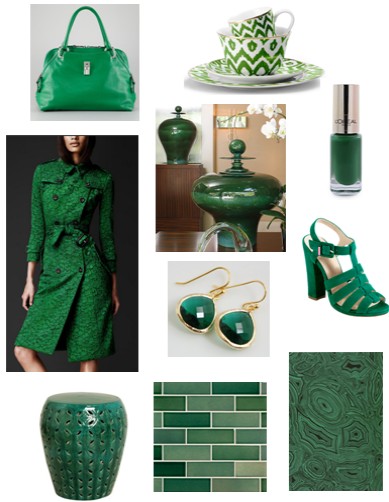
             Handbag – Marc Jacobs – Rio Satchel Bag /Dinnerware – C Wonder
            Nail Polish – L’oreal / Trench Coat – Burberry/ Vases- Global Views
                 Earrings – Etsy / Shoes – Cole Haan/ Garden Seat – Emissary
                               Tile – Ann Sacks / Wallpaper – Cole and Sons


Design Around the Television

Televisions had come a long way in the past ten years and continue to surprise me with all the technology and gadgets they have to offer. Back in my day, there was no such thing as remote much less high-definition anything. It was called a television “set” and it sat on a table…yes, just a regular table.

Today it is all about the flat screen television. In order to enhance the look of the television or enhance the wall that it is mounted on, here are a few solutions to design around the television.

Arranging art on the wall around the television is a great way to disguise it, so to speak. It can simply blend into the wall and appear to be part of the art arrangement or gallery.

Design around the Television - Interior Walls Designs

image via pinterest

Placing the television above the fireplace is still quite common in many living spaces. Hammersmith of Atlanta finished the area with millwork to enhance the fireplace and its surroundings.

Design around the Television - Interior Walls Designs

Other solutions include using sliding doors on a metal tracks to conceal the television when not in use.

Design around the Television - Interior Walls Designs

image via HGTV Green Home 2011

image via pinterest- favorite places & spaces

Instead of just mounting the television on the wall, another approach is to frame the television like your would frame a mirror or picture. This will integrate the television into the wall and be a more finished, stylish look.

Design around the television

image via The Art of TV – 2012 San Francisco Decorator Showcase – Designer Amy Weaver

Doors can also be hinged so that they open to the side for television viewing. Any type of art or graphic can be applied to the doors.

Design around the Television - Interior Walls Designs

image via pinterest

Hue Knew? – The Color Yellow

The most highly visible off all the colors is yellow. The psychology of this color is that it is illuminating and inspiring. It evokes happiness and cheer. According to Tuned-In, yellow stimulates mental activity. It has been said that when humans write and then read something back from a pastel yellow piece of paper, their brains have a better shot at remembering the information. Maybe that is why small memo pads are yellow. And what about the Yellow Pages? Maybe there is some science behind these theories.

This color can also produce anxiety in some situations and make one feel anxious. Some studies say that large amounts of it should not be used in nurseries for it can make babies cry.

Using yellow can perk up any gray or blue setting to suggest instant freshness. Designer Steve Gambrel used a mustard tone to liven up this living area.

Hue Knew? The Color Yellow - Interior Walls Designs

image via House and Home – Designer Steve Gambrel

Hue Knew? The Color Yellow - Interior Walls Designs

A great sense of balance in created by using the color navy. It is not as harsh as black and therefore reads well in a space.

Hue Knew? The Color Yellow

image via pinterest

The grey-green walls are in this living space are brought to life with the floor to ceiling drapery panels. Trim details on the leading edge of the drapery relate back to the wall color.Hue Knew? The Color Yellow

Hue Knew? The Color Yellow

image via Traditional Home – Designer Barry Dixon

Cowhide Rugs: Pattern and Patchwork

Cowhides…either you love them or hate them. You want one, or you will never own one. Plain and simple.

Cowhide rugs are more popular than ever and have made a new design statement when it comes to the various patterns that are now available. The typical cowhide shape is still popular but the new trend is the patterned and patchwork hides. You can purchase a hide in varying styles and patterns including stripes, chevron and patchwork.

Cowhide Rugs - Patchwork Design

image via House and Home – Designer Nam Dang- Mitchell

Available in many color combinations, they can even be dyed to a color of your choice. At the recent Atlanta Gift and Home Furnishings Market in Atlanta, there was a wonderful representation shown by Saddlemans.

2013-01-14_140604

This serene living area uses this patchwork rug to ground the neutral sofa. Hints of blue also add a sense of restfulness to the space.

Cowhide Rugs Interior Walls Designs

image via House Beautiful June 2011 – Designer Sally Markham

Designer Kristine Paige Kamenstein brings interest and texture to this foyer by  introducing the neutral geometric cowhide .

Cowhide Rugs Interior Walls Designs

image via Angeleno Interiors Spring 2010

Crosby Street Hotel – New York City

While visiting New York city this past fall, we met a friend in SoHo at the Crosby Street Hotel before heading to dinner. The hotel is nestled on a cobblestone street in the heart of SoHo. (SoHo is a district in the city where its name is given for it refers to the area of town south of Houston Street).

Entering the charming and whimsical lobby, I believe I actually sighed out loud. I felt as if I was in designer heaven. There is a designer heaven, right?

Crosby Street Hotel

To the right of the lobby is the drawing room. Cozy sofas and chairs fill the room which offers a quiet and private setting for guests to relax.

Crosby Street  Hotel - Drawing Room

The main bar area is to the left of the lobby and is even more welcoming than I could imagine. At night, the celadon green walls and jewel toned fabrics feel warm and inviting. Telephones arranged on the wall added that fun and creative character to the space.

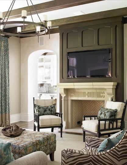
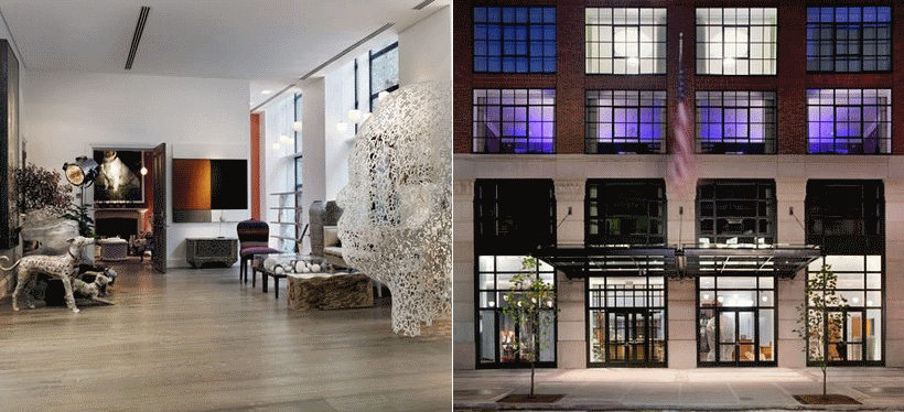
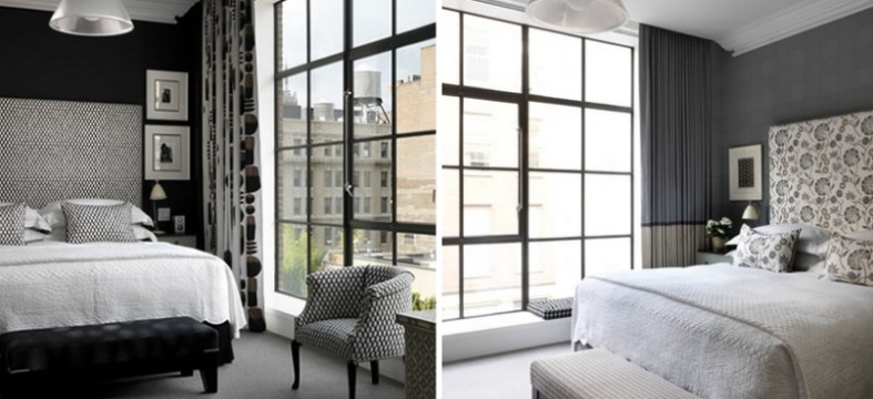
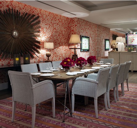
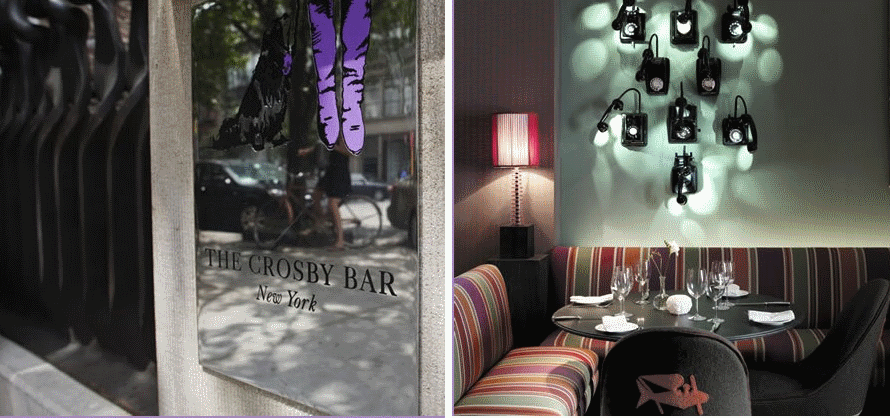
The Firmdale Hotels owns seven other hotels all in London, England. The hotel group is owned by Tim and Kit Kemp. Kit is the design genius behind this fabulous hotel. All of the hotels are designed differently which reflect her unique personal style. The Crosby Street Hotel opened in 2009 and features 86 rooms, bar and restaurant, private meeting spaces and terrace. The 11-story brownstone has floor to ceiling windows throughout and is a LEED certified property.
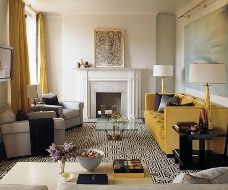
The designer’s taste level is impeccable and is evident in all aspects of the hotel. Meeting areas are spacious and offer an intriguing sense of style and whimsy.

images via Crosby Street Hotel