Confident With Color

In my career as a designer, nothing is discussed more and in greater detail than color. There is more passion and opinion given by my clients in regards to color than any other aspect of the entire home. Even more than money or budget.

People are passionate about the presence or the absence of color and how it will be utilized in their home. They definitely have a need and desire for color but is the hardest aspect for them to express. Asking someone what colors they like is a hard question for most people. I have found it is easier to ask my client what colors they do not like or want in their home. This process of elimination will then help determine a color palette for which they are comfortable.

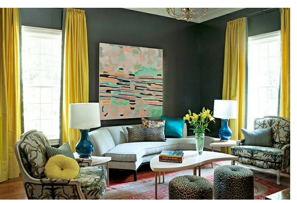
Are you confident with color? Could you be bold and add large amounts of color to your home?

mabley handler hamptons showhoues

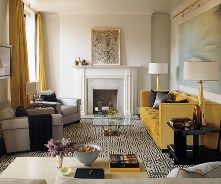
 Designer Madley Handler –  Traditional Home

The intensity and the value of the color are always considered in all of my projects. Value is simply how a color reads in terms of being dark or light. Navy is the dark value of blue. Intensity is the brightness of a color such as fire engine red.
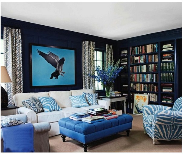
Confident in Color

 image via pinterest

Pink is the most gender specific of all the colors. This color is often associated with sweets like candy and bubble gum. Femininity is often linked to this color so plan carefully when using pink.
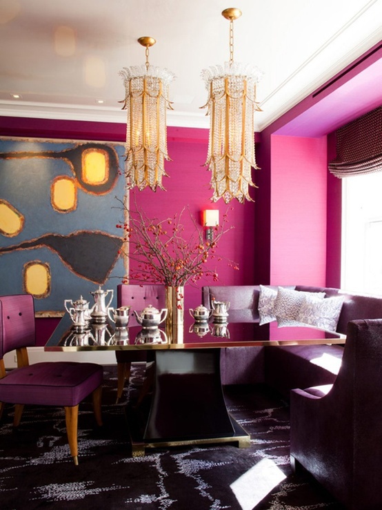
Confident in Color

image via pinterest

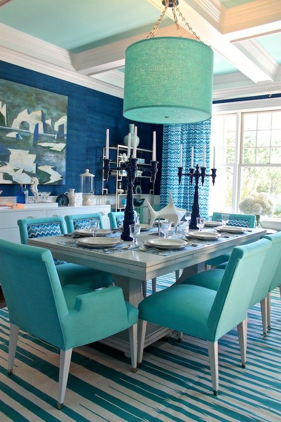
For decades, hospital scrubs have been typically green in color for green is the opposite of red on the color wheel therefore the eye adjusts better when in surgery. Blue is also used today for hospital scrubs for it refreshes a surgeon’s vision when seeing large amounts of red.

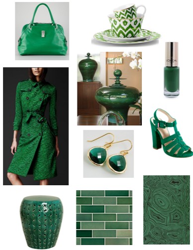
According to Psychology Today, choosing a favorite color says a lot about a person. People that like green typically are aware of their reputation and what others think of them.
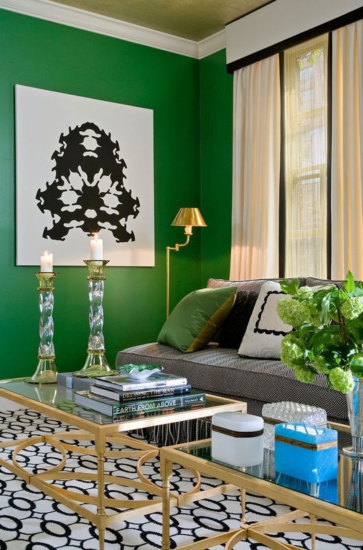
Confident With Colorimage via pinterest

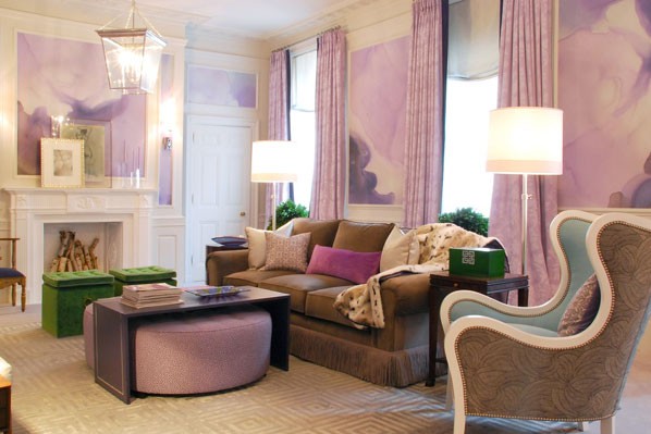
If your are a fan of the color purple, they say you are a person that is unique and artistic.

Confident With Color

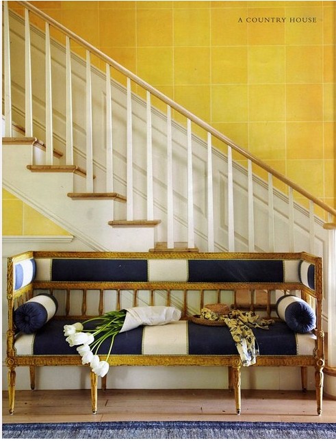
Designer Eileen Kathryn Boyd – Traditional Home


Emerald Green: 2013 Pantone Color of the Year

Every December Pantone picks the “new color of the year”. If you are not familiar with Pantone Inc; it is a corporation in New Jersey that is best known for its Pantone Matching System (PMS) which in used in many industries that manufacture paint, plastics and fabric. For 2013, Pantone’s color is emerald green. It is lively as well as radiant and lush. This color is known to enhance our sense of well-being, balance and harmony.

How do they choose a color of the year?  According to Pantone, they scout out different cultures and influences around the globe looking for inspiration.

What does it mean to fashion and the home furnishings industry when they choose a color? It means that this year you will see a surge of this color in everything from handbags and shoes to fabrics and household items.


Pantone 2013 Color of the Year


             Handbag – Marc Jacobs – Rio Satchel Bag /Dinnerware – C Wonder
            Nail Polish – L’oreal / Trench Coat – Burberry/ Vases- Global Views
                 Earrings – Etsy / Shoes – Cole Haan/ Garden Seat – Emissary
                               Tile – Ann Sacks / Wallpaper – Cole and Sons


Hue Knew? – The Color Yellow

The most highly visible off all the colors is yellow. The psychology of this color is that it is illuminating and inspiring. It evokes happiness and cheer. According to Tuned-In, yellow stimulates mental activity. It has been said that when humans write and then read something back from a pastel yellow piece of paper, their brains have a better shot at remembering the information. Maybe that is why small memo pads are yellow. And what about the Yellow Pages? Maybe there is some science behind these theories.

This color can also produce anxiety in some situations and make one feel anxious. Some studies say that large amounts of it should not be used in nurseries for it can make babies cry.

Using yellow can perk up any gray or blue setting to suggest instant freshness. Designer Steve Gambrel used a mustard tone to liven up this living area.

Hue Knew? The Color Yellow - Interior Walls Designs

image via House and Home – Designer Steve Gambrel

Hue Knew? The Color Yellow - Interior Walls Designs

A great sense of balance in created by using the color navy. It is not as harsh as black and therefore reads well in a space.

Hue Knew? The Color Yellow

image via pinterest

The grey-green walls are in this living space are brought to life with the floor to ceiling drapery panels. Trim details on the leading edge of the drapery relate back to the wall color.Hue Knew? The Color Yellow

Hue Knew? The Color Yellow

image via Traditional Home – Designer Barry Dixon